1. Have a strong, clear brand
Your web site should pitch the image you would like the world to see. A great web designer could control what sort of image the world will see. In terms of physical design, this means placing your logo or underlying message in the top left-hand corner (the part of the screen our eyes are most naturally drawn to).
2. Provide a clear, concise navigation method
A good web designer will ensure that they help lead the user around the screen and site and make the people want to stay. Clearly differentiated sub-sections and even a site map can provide a concise, easy to follow navigation route. While also having good use of position, colour, contrast and size can all help focus the eye to critical areas and help navigate the page. REMEMBER to stick to one main navigation menu, and keep it consistent throughout the site.
3. Make it intuitively easy to use
Visitors can be fickle, and if a website is hard or slow to navigate, they’ll be off. Ensure navigation buttons are apparent and easily identifiable (towards the top of the page is good) and have appropriate links directly from page to page so the user can quickly switch when something catches their interest. Finally, adhere to the functionalities people have come to expect. For example, if the text is underlined, your user will naturally expect it to be a link.
4. Keep it consistent
Users like to know where they are within a website, and if the style of a page changes dramatically or somehow feels different visitors will become disengaged and can start to feel lost. Maintain consistency by ensuring everything matches, from heading sizes and typefaces to design, colour and style of image.
5. Keep it simple stupid (KISS)
The whole point of using a website is that it should be quick and easy to use. To this end, simplicity is vital.
The more complicated a website, the higher the drop off count.
6. Ensure it’s easy to understand
Visitors coming to your website typically won’t want to spend much time so ensure that every aspect is easy to understand. Various design techniques can help make the information on a page easier to understand (shorter sentences, larger font, sections differentiated by contrast and colour and, as previously mentioned, proper use of white space). To this end, there are some standard rules of thumb: never use more than three typefaces, or more than three different point sizes for a font and keep lines of text to the point!
7. Degrade gracefully
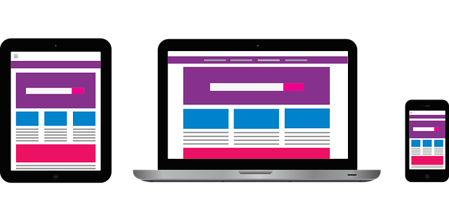
Not everyone has the most up to date web browser! So to ensure you do not lose those people, make sure your website works on multi-platforms. Besides, not everyone has the most up to date PC or broadband plans! Ensure your websites code is as simple as it can be without drawing back in quality.
8. Write it with your target audience in mind
When writing, ensure you are thinking about your customer and target audience. As tempting as it is to overboard people with information, the more you specialise, the higher your conversion rates will be, this is due to you being able to target your specific audience and catch them, rather than the few stragglers.
9. Consider usability
At the end of the day if your website isn’t usable visitors will be off. So, when working on the web design, consider the end user’s experience of the site.
It can be a good idea to make a list of the things a user will want to use your site for and then checking that these are easy to achieve and if necessary are readily available from the homepage
10. Make sure it’s compliant
A good website should adhere to specific guidelines.


